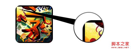
在css3中,直接在图片上使用box-shadow 和 border-radius,浏览器并不能很好的渲染。但是如果把图片作为background-image,添加的样式浏览器可以很好的渲染。我将会介绍如何使用box-shadow, border-radius 和 transition创建不同图片样式效果。
问题
通过查看demo能注意到,我们为第一行图片设置了border-radius 和 内嵌box-shadow。firefox渲染了图片的border-radius,但是没有渲染内嵌box-shadow。chrome和Safari两种效果都没有渲染。
复制代码代码如下:
.normal img {
border: solid 5px #000;
-webkit-border-radius: 20px;
-moz-border-radius: 20px;
border-radius: 20px;
-webkit-box-shadow: inset 0 1px 5px rgba(0,0,0,.5);
-moz-box-shadow: inset 0 1px 5px rgba(0,0,0,.5);
box-shadow: inset 0 1px 5px rgba(0,0,0,.5);
}
firefox效果: 
chrome/safari 
变通方案
为了使border-radius 和 内嵌box-shadow能够正常工作,我们需要把图片转换成background-image的方式。 
动态方式
为了动态完成这一工作,我们需要借助jquery为每一个图片添加背景图片的包装。下面的js代码为每一个图片添加了一个span的包装,span的背景图片路径就是图片的路径。
代码比较简单,我想就没有讲解的必要了。不清楚了可以直接去查jquery的api。
复制代码代码如下:
<script type="text/javascript" src="/UploadFiles/2021-03-30/jquery.min.js"><script type="text/javascript">
$(document).ready(function(){
$("img").load(function() {
$(this).wrap(function(){
return '<span class="image-wrap ' + $(this).attr('class') + '" style="position:relative; display:inline-block; background:url(' + $(this).attr('src') + ') no-repeat center center; width: ' + $(this).width() + 'px; height: ' + $(this).height() + 'px;" />';
});
$(this).css("opacity","0");
});
});
</script>
输出
上面的代码会输出如下结果:
复制代码代码如下:
<span class="image-wrap " style="position:relative; display:inline-block; background:url(image.jpg) no-repeat center center; width: 150px; height: 150px;">
<img src="/UploadFiles/2021-03-30/image.jpg"></span>
圆形图片
添加我们使用border-radius来实现圆形图片的效果,效果如下: 
css:
复制代码代码如下:
.circle .image-wrap {
-webkit-border-radius: 50em;
-moz-border-radius: 50em;
border-radius: 50em;
}
卡片风格
下面是卡片风格的图片,使用了多个内嵌box-shadow。 
css:
复制代码代码如下:
.card .image-wrap {
-webkit-box-shadow: inset 0 0 1px rgba(0,0,0,.8), inset 0 2px 0 rgba(255,255,255,.5), inset 0 -1px 0 rgba(0,0,0,.4);
-moz-box-shadow: inset 0 0 1px rgba(0,0,0,.8), inset 0 2px 0 rgba(255,255,255,.5), inset 0 -1px 0 rgba(0,0,0,.4);
box-shadow: inset 0 0 1px rgba(0,0,0,.8), inset 0 2px 0 rgba(255,255,255,.5), inset 0 -1px 0 rgba(0,0,0,.4);
-webkit-border-radius: 20px;
-moz-border-radius: 20px;
border-radius: 20px;
}
浮雕风格
下面是浮雕效果。 
css:
复制代码代码如下:
.embossed .image-wrap {
-webkit-box-shadow: inset 0 0 2px rgba(0,0,0,.8), inset 0 2px 0 rgba(255,255,255,.5), inset 0 -7px 0 rgba(0,0,0,.6), inset 0 -9px 0 rgba(255,255,255,.3);
-moz-box-shadow: inset 0 0 2px rgba(0,0,0,.8), inset 0 2px 0 rgba(255,255,255,.5), inset 0 -7px 0 rgba(0,0,0,.6), inset 0 -9px 0 rgba(255,255,255,.3);
box-shadow: inset 0 0 2px rgba(0,0,0,.8), inset 0 2px 0 rgba(255,255,255,.5), inset 0 -7px 0 rgba(0,0,0,.6), inset 0 -9px 0 rgba(255,255,255,.3);
-webkit-border-radius: 20px;
-moz-border-radius: 20px;
border-radius: 20px;
}
柔性浮雕风格
相对于浮雕样式,新样式添加了1px blur属性。 
css:
复制代码代码如下:
.soft-embossed .image-wrap {
-webkit-box-shadow: inset 0 0 4px rgba(0,0,0,1), inset 0 2px 1px rgba(255,255,255,.5), inset 0 -9px 2px rgba(0,0,0,.6), inset 0 -12px 2px rgba(255,255,255,.3);
-moz-box-shadow: inset 0 0 4px rgba(0,0,0,1), inset 0 2px 1px rgba(255,255,255,.5), inset 0 -9px 2px rgba(0,0,0,.6), inset 0 -12px 2px rgba(255,255,255,.3);
box-shadow: inset 0 0 4px rgba(0,0,0,1), inset 0 2px 1px rgba(255,255,255,.5), inset 0 -9px 2px rgba(0,0,0,.6), inset 0 -12px 2px rgba(255,255,255,.3);
-webkit-border-radius: 20px;
-moz-border-radius: 20px;
border-radius: 20px;
}
抠图风格
使用内嵌box-shadow就可以实现抠图效果。 
css:
复制代码代码如下:
.cut-out .image-wrap {
-webkit-box-shadow: 0 1px 0 rgba(255,255,255,.2), inset 0 4px 5px rgba(0,0,0,.6), inset 0 1px 0 rgba(0,0,0,.6);
-moz-box-shadow: 0 1px 0 rgba(255,255,255,.2), inset 0 4px 5px rgba(0,0,0,.6), inset 0 1px 0 rgba(0,0,0,.6);
box-shadow: 0 1px 0 rgba(255,255,255,.2), inset 0 4px 5px rgba(0,0,0,.6), inset 0 1px 0 rgba(0,0,0,.6);
-webkit-border-radius: 20px;
-moz-border-radius: 20px;
border-radius: 20px;
}
变形和发光
在这个例子中我们为图片包装添加transition属性,鼠标滑过的时候,他会从圆角变为圆形。然后我们使用多个box-shadow实现发光效果。 
css:
复制代码代码如下:
.morphing-glowing .image-wrap {
-webkit-transition: 1s;
-moz-transition: 1s;
transition: 1s;
-webkit-border-radius: 20px;
-moz-border-radius: 20px;
border-radius: 20px;
}
.morphing-glowing .image-wrap:hover {
-webkit-box-shadow: 0 0 20px rgba(255,255,255,.6), inset 0 0 20px rgba(255,255,255,1);
-moz-box-shadow: 0 0 20px rgba(255,255,255,.6), inset 0 0 20px rgba(255,255,255,1);
box-shadow: 0 0 20px rgba(255,255,255,.6), inset 0 0 20px rgba(255,255,255,1);
-webkit-border-radius: 60em;
-moz-border-radius: 60em;
border-radius: 60em;
}
高光效果
高光的效果是通过为元素添加 :after 伪类实现的。 
css:
复制代码代码如下:
.glossy .image-wrap {
-webkit-box-shadow: inset 0 -1px 0 rgba(0,0,0,.5);
-moz-box-shadow: inset 0 -1px 0 rgba(0,0,0,.5);
box-shadow: inset 0 -1px 0 rgba(0,0,0,.5);
-webkit-border-radius: 20px;
-moz-border-radius: 20px;
border-radius: 20px;
}
.glossy .image-wrap:after {
position: absolute;
content: ' ';
width: 100%;
height: 50%;
top: 0;
left: 0;
-webkit-border-radius: 20px;
-moz-border-radius: 20px;
border-radius: 20px;
background: -moz-linear-gradient(top, rgba(255,255,255,0.7) 0%, rgba(255,255,255,.1) 100%);
background: -webkit-gradient(linear, left top, left bottom, color-stop(0%,rgba(255,255,255,0.7)), color-stop(100%,rgba(255,255,255,.1)));
background: linear-gradient(top, rgba(255,255,255,0.7) 0%,rgba(255,255,255,.1) 100%);
}
倒影效果
在这个例子中,我们将高光效果移到底部就实现倒影效果。 
css:
复制代码代码如下:
.reflection .image-wrap:after {
position: absolute;
content: ' ';
width: 100%;
height: 30px;
bottom: -31px;
left: 0;
-webkit-border-top-left-radius: 20px;
-webkit-border-top-right-radius: 20px;
-moz-border-radius-topleft: 20px;
-moz-border-radius-topright: 20px;
border-top-left-radius: 20px;
border-top-right-radius: 20px;
background: -moz-linear-gradient(top, rgba(0,0,0,.3) 0%, rgba(255,255,255,0) 100%);
background: -webkit-gradient(linear, left top, left bottom, color-stop(0%,rgba(0,0,0,.3)), color-stop(100%,rgba(255,255,255,0)));
background: linear-gradient(top, rgba(0,0,0,.3) 0%,rgba(255,255,255,0) 100%);
}
.reflection .image-wrap:hover {
position: relative;
top: -8px;
}
高光和倒影
本例我们使用:before 和 :after 将高光和倒影效果组合起来。 
css:
复制代码代码如下:
.glossy-reflection .image-wrap {
-webkit-box-shadow: inset 0 -1px 0 rgba(0,0,0,.5), inset 0 1px 0 rgba(255,255,255,.6);
-moz-box-shadow: inset 0 -1px 0 rgba(0,0,0,.5), inset 0 1px 0 rgba(255,255,255,.6);
box-shadow: inset 0 -1px 0 rgba(0,0,0,.5), inset 0 1px 0 rgba(255,255,255,.6);
-webkit-transition: 1s;
-moz-transition: 1s;
transition: 1s;
-webkit-border-radius: 20px;
-moz-border-radius: 20px;
border-radius: 20px;
}
.glossy-reflection .image-wrap:before {
position: absolute;
content: ' ';
width: 100%;
height: 50%;
top: 0;
left: 0;
-webkit-border-radius: 20px;
-moz-border-radius: 20px;
border-radius: 20px;
background: -moz-linear-gradient(top, rgba(255,255,255,0.7) 0%, rgba(255,255,255,.1) 100%);
background: -webkit-gradient(linear, left top, left bottom, color-stop(0%,rgba(255,255,255,0.7)), color-stop(100%,rgba(255,255,255,.1)));
background: linear-gradient(top, rgba(255,255,255,0.7) 0%,rgba(255,255,255,.1) 100%);
}
.glossy-reflection .image-wrap:after {
position: absolute;
content: ' ';
width: 100%;
height: 30px;
bottom: -31px;
left: 0;
-webkit-border-top-left-radius: 20px;
-webkit-border-top-right-radius: 20px;
-moz-border-radius-topleft: 20px;
-moz-border-radius-topright: 20px;
border-top-left-radius: 20px;
border-top-right-radius: 20px;
background: -moz-linear-gradient(top, rgba(230,230,230,.3) 0%, rgba(230,230,230,0) 100%);
background: -webkit-gradient(linear, left top, left bottom, color-stop(0%,rgba(230,230,230,.3)), color-stop(100%,rgba(230,230,230,0)));
background: linear-gradient(top, rgba(230,230,230,.3) 0%,rgba(230,230,230,0) 100%);
}
胶带风格
在这个例子中,我们使用:after来实现胶带的效果。 
css:
复制代码代码如下:
.tape .image-wrap {
-webkit-box-shadow: inset 0 0 2px rgba(0,0,0,.7), inset 0 2px 0 rgba(255,255,255,.3), inset 0 -1px 0 rgba(0,0,0,.5), 0 1px 3px rgba(0,0,0,.4);
-moz-box-shadow: inset 0 0 2px rgba(0,0,0,.7), inset 0 2px 0 rgba(255,255,255,.3), inset 0 -1px 0 rgba(0,0,0,.5), 0 1px 3px rgba(0,0,0,.4);
box-shadow: inset 0 0 2px rgba(0,0,0,.7), inset 0 2px 0 rgba(255,255,255,.3), inset 0 -1px 0 rgba(0,0,0,.5), 0 1px 3px rgba(0,0,0,.4);
}
.tape .image-wrap:after {
position: absolute;
content: ' ';
width: 60px;
height: 25px;
top: -10px;
left: 50%;
margin-left: -30px;
border: solid 1px rgba(137,130,48,.2);
background: -moz-linear-gradient(top, rgba(254,243,127,.6) 0%, rgba(240,224,54,.6) 100%);
background: -webkit-gradient(linear, left top, left bottom, color-stop(0%,rgba(254,243,127,.6)), color-stop(100%,rgba(240,224,54,.6)));
background: linear-gradient(top, rgba(254,243,127,.6) 0%,rgba(240,224,54,.6) 100%);
-webkit-box-shadow: inset 0 1px 0 rgba(255,255,255,.3), 0 1px 0 rgba(0,0,0,.2);
}
变形和着色
在这个例子中,我们在元素上使用:after,当鼠标进过的时候实现径向渐变的效果。 
css:
复制代码代码如下:
.morphing-tinting .image-wrap {
position: relative;
-webkit-transition: 1s;
-moz-transition: 1s;
transition: 1s;
-webkit-border-radius: 20px;
-moz-border-radius: 20px;
border-radius: 20px;
}
.morphing-tinting .image-wrap:hover {
-webkit-border-radius: 30em;
-moz-border-radius: 30em;
border-radius: 30em;
}
.morphing-tinting .image-wrap:after {
position: absolute;
content: ' ';
width: 100%;
height: 100%;
top: 0;
left: 0;
-webkit-transition: 1s;
-moz-transition: 1s;
transition: 1s;
-webkit-border-radius: 30em;
-moz-border-radius: 30em;
border-radius: 30em;
}
.morphing-tinting .image-wrap:hover:after {
background: -webkit-gradient(radial, 50% 50%, 40, 50% 50%, 80, from(rgba(0,0,0,0)), to(rgba(0,0,0,1)));
background: -moz-radial-gradient(50% 50%, circle, rgba(0,0,0,0) 40px, rgba(0,0,0,1) 80px);
}
羽化边缘圆形
我们同样可以使用径向渐变产生遮罩,实现羽化的效果。 
css:
复制代码代码如下:
.feather .image-wrap {
position: relative;
-webkit-border-radius: 30em;
-moz-border-radius: 30em;
border-radius: 30em;
}
.feather .image-wrap:after {
position: absolute;
content: ' ';
width: 100%;
height: 100%;
top: 0;
left: 0;
background: -webkit-gradient(radial, 50% 50%, 50, 50% 50%, 70, from(rgba(255,255,255,0)), to(rgba(255,255,255,1)));
background: -moz-radial-gradient(50% 50%, circle, rgba(255,255,255,0) 50px, rgba(255,255,255,1) 70px);
}
浏览器兼容性
这种实现方式在大多数支持border-radius, box-shadow, :before and :after特性的浏览器中(例如Chrome, Firefox 和 Safari),都能很好的工作。在不支持新特性的浏览器中,只会显示原始图片。
创造你自己的实现
借助:before 和:after伪类能为图片创造很多种样式,你可以自己尝试创建出新的效果。
css3,属性,图片,样式
免责声明:本站文章均来自网站采集或用户投稿,网站不提供任何软件下载或自行开发的软件! 如有用户或公司发现本站内容信息存在侵权行为,请邮件告知! 858582#qq.com
稳了!魔兽国服回归的3条重磅消息!官宣时间再确认!
昨天有一位朋友在大神群里分享,自己亚服账号被封号之后居然弹出了国服的封号信息对话框。
这里面让他访问的是一个国服的战网网址,com.cn和后面的zh都非常明白地表明这就是国服战网。
而他在复制这个网址并且进行登录之后,确实是网易的网址,也就是我们熟悉的停服之后国服发布的暴雪游戏产品运营到期开放退款的说明。这是一件比较奇怪的事情,因为以前都没有出现这样的情况,现在突然提示跳转到国服战网的网址,是不是说明了简体中文客户端已经开始进行更新了呢?